Sometimes you want to create a clean and vanilla studio shot, whether to showcase glamour or something else. Regardless of the goal, you may run into issues while achieving a well-balanced image using only the base features of Gpose.
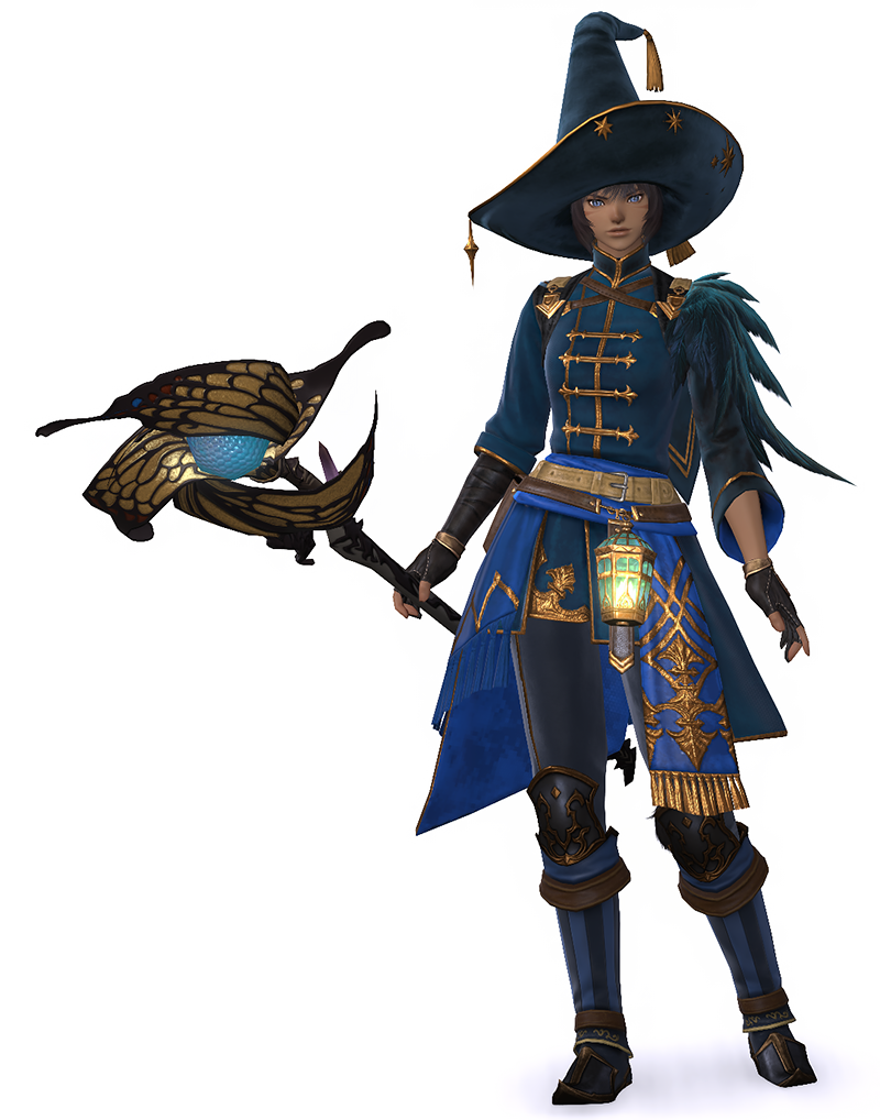
In this guide, I will explain how to go from the image on the left, to the image on the right, using only vanilla Gpose.
Setting up the studio
Start by setting up a simple Gpose studio. You do not need an elaborate space for this. An FC room or an apartment works perfectly well. If you have access to neither, you are welcome to use the studio shown on this page, located on Aether – Faerie, Ward 22, Apartment 1.
For this setup, you will be using the White Screen furniture item. These can be purchased from the Housing Merchant, so there is no need to spend much gil. You can arrange them however you like, but three placed in a row is sufficient.
For lighting, try to choose something as neutral in colour as possible. In this case, I will be using the Riviera Chandelier (also purchasable with the Housing Merchant). While it still has a yellow tint, it is relatively neutral, and is one of the most accessible options available. I personally find yellow light easier to work with than other colours when it comes to white balancing.
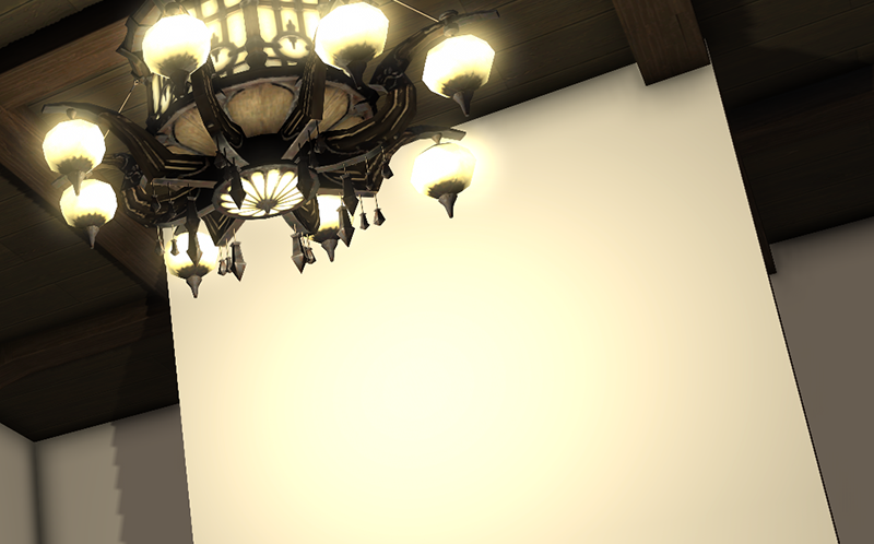
Place the screens some distance away from the room’s main light source. This helps prevent glare on the screen.
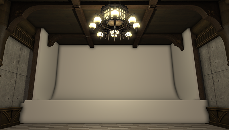
Once your studio is set up, it should look something like this. You can now place your character in the centre and enter Gpose.
White Balancing
This guide is aimed at vanilla users, but I do want to mention for ReShade users, that if you want to white balance this specific setup, you can do so using the ReShade preset “nyanya.studio – studio (any version)”, available in my preset collection.
For those without access to ReShade, we will use lighting to balance the colours instead.
We will only be using the lights available in the Gpose lighting tab. We will not be adjusting the manual brightness slider.
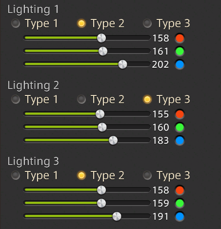
I will place all three lights.
- Light 1 is placed facing the character’s front.
- Light 2 is placed facing the character’s left side (our POV).
- Light 3 is placed facing the character’s right side (our POV).
To counteract yellow, you need to introduce more blue into the scene. For this reason, the blue sliders on my lights are set higher than the others. If the overall scene feels too dark, you can raise all sliders equally to increase the overall intensity.
I only set one of the side lights to type 3, as this creates more dynamic shadows than setting all of them to type 3. This is, of course, a matter of personal preference.
You can adjust the types of lighting, the intensity and the colour as you see fit. The settings shown above are not a requirement, and instead are a guideline.
Good luck!